My plan for the week
- Create a first version of the Score page.
- Make the toolbar match the design.
- Make the bottom nav bar match the design.
What I actually did this week
This week I again accomplished what I had planned. Here are the updates to the app:
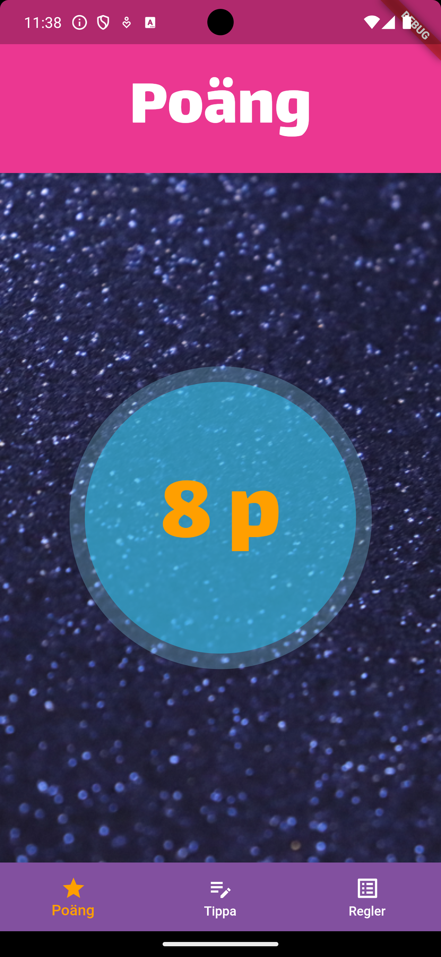
- First version of the Score page.
- Top toolbar matches the design.
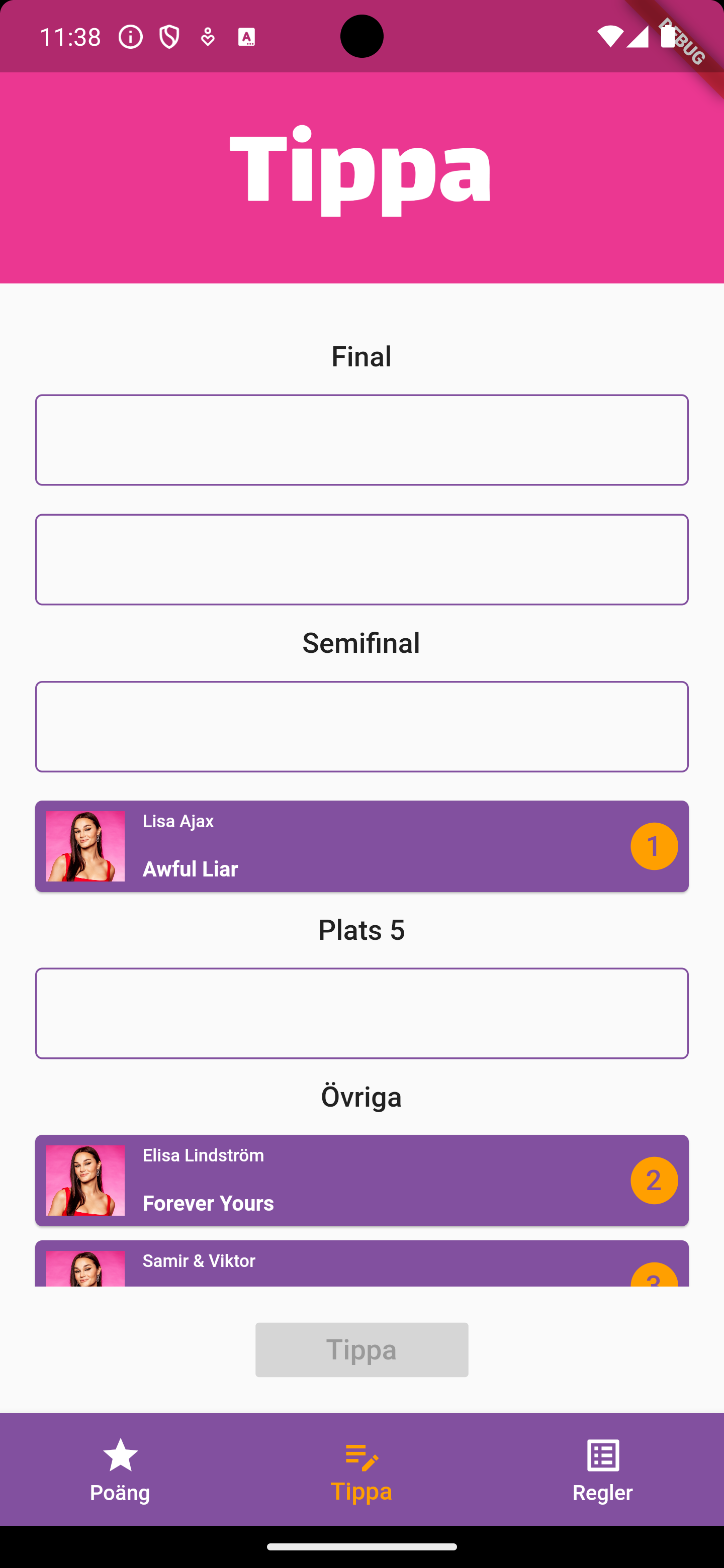
- Bottom nav bar sort of matches the design.
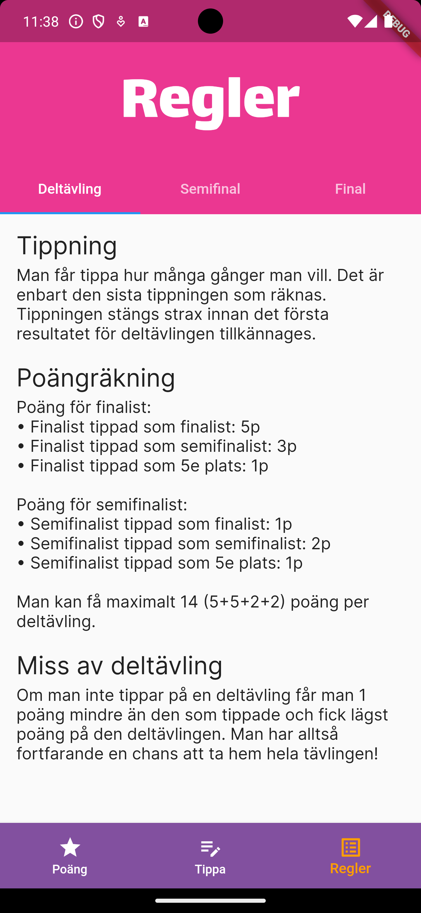
- Started working on the Rules page.
Here’s what the pages look like now:
| Score page | Prediction page | Rules page |
|---|---|---|
 |
 |
 |
The bottom nav bar is like the design apart from the icons. The tabs in the Rules page are part of the Toolbar since that’s the standard way to do it in Flutter. Everything in the app is in Swedish since Melodifestivalen is a Swedish competition and mostly viewed by Swedes. Maybe I’ll add localisation at some point, but it’s definitely not a high priority right now.
I think the app is starting to look quite nice!
Next week
The next big topic is either going to be sign up and login or groups. The way the app works right now users need to be logged in to use it at all. It’s not the best user experience to be greated with a sign up page right after downloading and starting the app, so we might want to move sign up and login to a later point in the user journey. I will have a discussion with the designer to decide how we should prioritize this compared to other features, like being able to create and join groups.
My plan for next week:
- Finish a first version of the Rules page.
- Add an option to log out.
- Work on the sign up & login flows or Groups.